According to Google’s latest user data gleaned from billions of searches it conducts every day, more people today connect to the internet using their handheld devices such as surface computers, smartphones and even feature phones than with traditional personal computers. This means that every website owner, in order to realize his or her website’s full potential, needs to ensure that internet users can view his or her website on screens of all sizes and resolutions. Therefore, using CSS techniques and principles of design that utilize table-less design, flexible images, fluid grids and media queries, a website design can deliver a quality user experience regardless of the size of the display screen.
One Website for All Devices
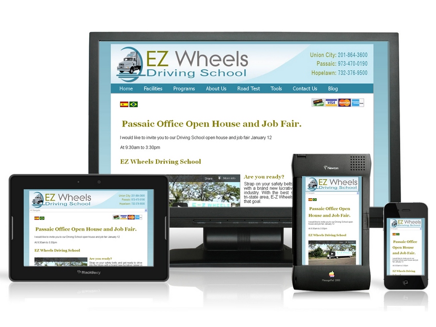
Building, maintaining and marketing a website is usually an expensive affair. That said, the aim of carrying out the mentioned activities is always to maximize the number of visitors in order to sell more of a product or service, or to publicize a product, brand, or cause. Traditional accessibility methods meant greater expense in terms of time and money because the website designer had to create different websites for different screen sizes and resolutions. Responsive design, on the other hand, means creating a website that adapts to the user, thus having one website for all devices, reducing the cost of development and maintenance considerably.
Improved Browser Support with Responsive Web Design
Every device utilizes a web browser of some kind to access websites. However, the lack of uniform implementation of web standards means that for the majority of websites, each browser displays the same website somewhat differently. However, responsive design supports about 80% of all browsers, and the figure rises to over 90% in mobile devices. Responsive principles anticipate these nuances and adapt the website to provide a more uniform experience across devices and browsers.
Achieve Higher Google Rankings
Google’s SEO ranks web pages and websites according to many parameters, a key one being how easy it is to view and navigate. According to the search engine’s recommendations for smartphones, “Google recommends webmasters follow the industry best practice of using responsive web design.” Google loves websites that are built with the principles of responsive design because of the fact that one URL per site is better than having many that lead to different versions. This combines the number of visitors that a website would get on its different URLs into one, and effectively increasing traffic and improving its page rank.
Provide An Improved And User-Friendly Experience For Visitors
Visitors to a responsively designed website will enjoy being able to share only a single URL instead of a different one per device. An additional benefit is that users will view the website easily as displayed without the need to zoom or scroll around in order to read the website content or view images. Users are likely to experience a sense of familiarity when a website appears on their handheld device exactly as it does on their personal computers, instead of a watered-down mobile version.
Despite the idea of responsive design being relatively new, it is definitely a powerful way to increase a website’s marketability and Search Engine Optimization. It is also a great way to lower the cost of building and maintaining a website.
Thank you Lou from VM Business Solutions for sharing this article.