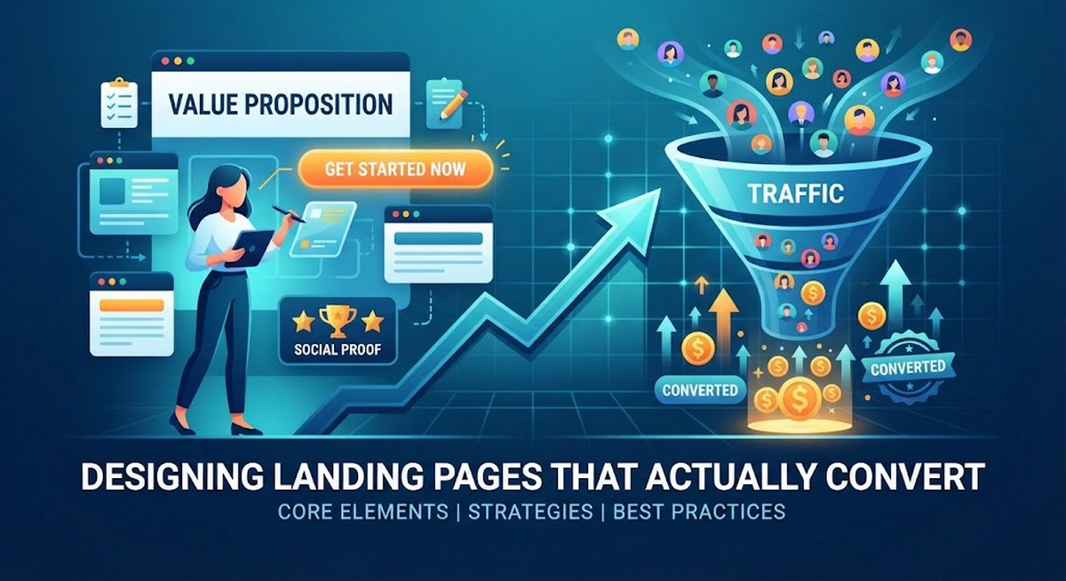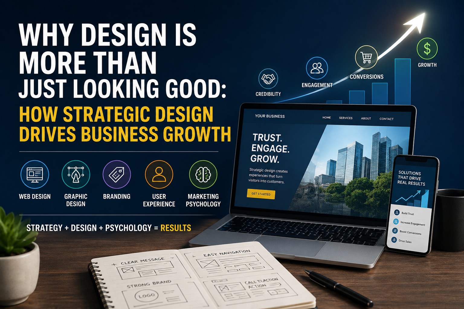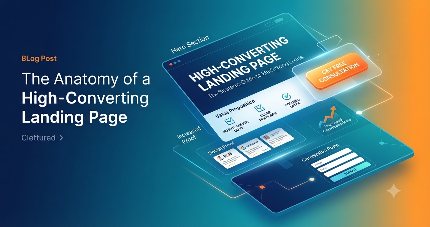
In today’s digital landscape, a website is more than just a digital brochure; it is your most powerful salesperson. When driving traffic—whether through organic search, paid social, or email marketing—every visitor deserves a destination that is built to convert.
A high-converting landing page isn’t about flashy animations or complex coding. It is a precise intersection of psychology, design, and user experience (UX).
1. The Hero Section: Capture Attention Instantly
The “hero” is the first thing a visitor sees. You have roughly three seconds to convince them they are in the right place.
- The Benefit-Driven Headline: Don’t just state what you do; state what the visitor gets. Instead of “Web Design Services,” try “Transform Your Business with a Website That Converts Visitors Into Clients.”
- The Supporting Sub-headline: Provide context and clarity. Elaborate on the “how” or the “why” behind the main promise.
- A Clear Primary CTA: Use a high-contrast button that stands out. Keep the text action-oriented, such as “Get My Free Audit” or “Start My Project.”
2. Strategic Use of Whitespace
Complexity is the enemy of conversion. If your page is cluttered with text and imagery, the user’s eye becomes fatigued, leading them to bounce.
- Breathing Room: Strategic use of whitespace guides the user’s eyes toward the most important elements—your value proposition and your CTA.
- Focused Messaging: Keep paragraphs short and use bullet points to break up technical information. This makes your content scannable for busy entrepreneurs and small business owners.
3. Social Proof and Authority
Before a lead converts, they need to trust you. Social proof serves as the “trust signal” that validates your claims.
- Logos and Accolades: Displaying logos of companies you have worked with or industry certifications builds immediate credibility.
- Client Testimonials: Use specific, results-oriented quotes. Instead of “Great service,” use “Working with this team increased our lead generation by 40% in just three months.”
- Case Studies: A link to a brief, data-backed success story can be the tipping point for someone on the fence.
4. The Value Proposition (The “Why”)
Once you have their attention, you must articulate why you are the best choice. This should be tailored to the specific pain points of your target audience.
- Address Pain Points: Explicitly state the problem the user is facing.
- Offer the Solution: Explain exactly how your service removes that barrier.
- Focus on Outcomes: Prospects are not buying a service; they are buying a result. Focus on the ROI, the time saved, or the increased revenue.
5. Frictionless Conversion
The final step is the conversion itself. Every unnecessary field in a form is a potential leak in your funnel.
- Keep Forms Minimal: Only ask for the information you absolutely need. Name and email are often enough to start the conversation.
- Visual Direction: Use design elements—like an arrow pointing toward your form or a person looking in the direction of the CTA—to draw the user’s eye exactly where you want it to go.
- Mobile Optimization: Ensure the page is fast and responsive. A landing page that takes more than three seconds to load on mobile is losing customers before they even see your offer.
Conclusion: Constant Refinement
A landing page is never truly “finished.” The best-performing pages are those that undergo constant A/B testing—swapping out headlines, testing different button colors, or adjusting the offer. By focusing on the core anatomy of a conversion-ready page, you establish the foundation necessary to build authority, capture leads, and grow your agency.