You’ve poured time, money, and creativity into launching a traffic campaign. Clicks are rolling in, but when you look at your analytics dashboard, reality hits: your conversion rate is flatlining.
The culprit? Often, it’s not your ad copy or your targeting it’s your landing page.
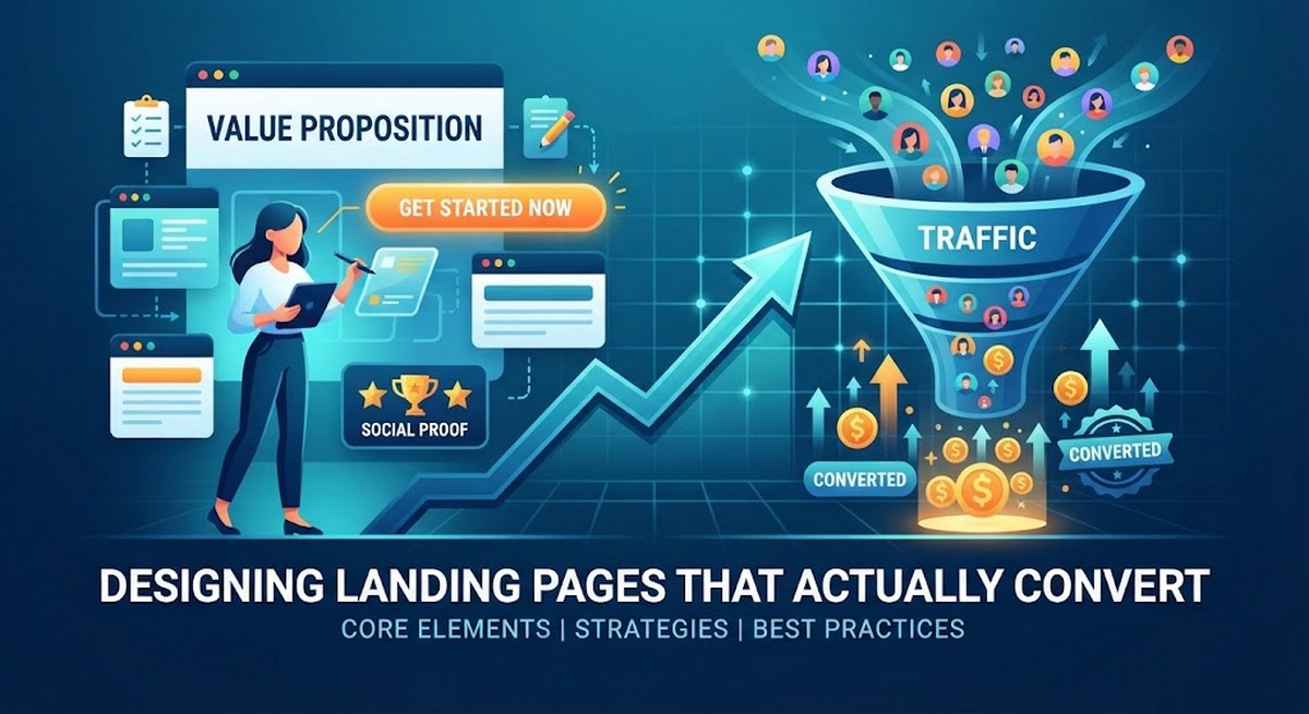
A high-converting landing page isn’t a digital brochure. It is a finely tuned conversion engine built around a singular psychological objective: getting the visitor to take one specific action. Let’s break down the essential strategies, architectural frameworks, and design principles you need to craft landing pages that actually turn clicks into customers.
Ready to Transform Your Landing Pages?
Stop letting valuable traffic slip through the cracks. Put these strategies into practice today and start turning your visitors into loyal customers.
1. Zero In on a Single, Obsessive Goal
The biggest mistake marketers make is treating a landing page like a mini-homepage. Homepages are for exploration; landing pages are for execution.
- The Rule of One: Every landing page should feature one offer, one audience, and one primary Call-to-Action (CTA).
- Prune the Navigation: Strip away your main header navigation, footer links, and social media icons. If a visitor has a dozen ways to click away from your page, they will. Keep them trapped in a frictionless loop of consideration and conversion.
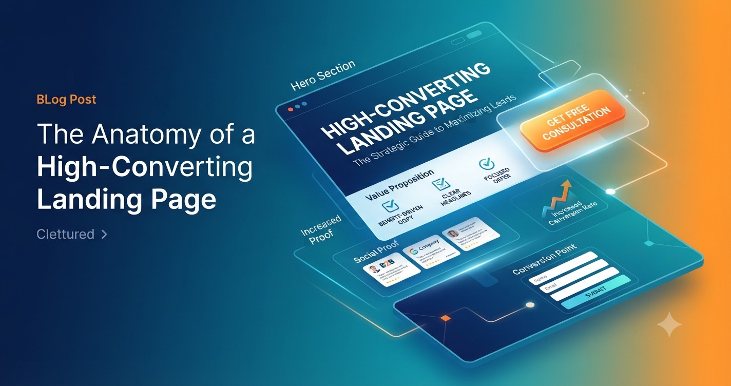
2. Nail the “Hero Section” in 3 Seconds
When a user lands on your page, they operate on a micro-attention span. Within three seconds, they need to answer a single question: “What’s in it for me?”
Your above-the-fold hero section must immediately establish value:
- The Benefit-Driven Headline: Don’t be clever at the expense of clarity. Name the outcome or the offer in plain, compelling language. (Bad: “Revolutionizing Your Workflow Ecosystem.” Good: “Automate Your Invoicing in Under 2 Minutes.”)
- The Supporting Subheadline: Expand slightly on the “how” or the “who,” reinforcing the promise made in the headline.
- The Visual Anchor: Use high-resolution imagery, a clean product mockup, or a short explainer video that visually maps out the future state of your customer using your product.
3. Leverage Social Proof to Lower Perceived Risk
Srangers are naturally skeptical. Even if your offer is incredible, visitors look for safety in numbers before handing over their email addresses or credit card numbers.
- Quantifiable Trust: Use real numbers (“Join over 250,000 marketers…”)
- Authority Signals: Display recognizable client logos, media features, or industry security badges.
- Targeted Testimonials: Go beyond generic praise. Feature reviews that explicitly call out an objection the user might have—such as ease of use, speed of implementation, or customer support quality.
4. Frictionless Forms and Relentless CTA Optimization
Your CTA is the finish line. Every design element on the page should subconsciously herd the visitor’s eyes toward that button.
- Design for Contrast: Your CTA button should use a color that visually pops against the rest of the page background.
- Action-Oriented Microcopy: Ditch lazy phrases like “Submit” or “Click Here.” Use first-person, value-driven text: “Get My Free Guide” or “Start My 14-Day Trial.”
- The Form Field Tax: Every extra field you add to a form drops your conversion rate. If you only need an email address to send a lead magnet, only ask for the email address. Save secondary information (company size, phone number) for later stages in your funnel via progressive profiling.
5. Prioritize Mobile-First Architecture
More than half of all web traffic arrives via mobile devices. If your landing page requires pinching, zooming, or awkward horizontal scrolling, your conversion rate will plummet, regardless of how good your desktop layout looks.
- Stacked Layouts: Ensure content elements gracefully stack vertically on smaller screens.
- Thumb-Friendly Targets: Make sure buttons and form fields are large enough to be easily tapped with a thumb.
- Speed Obsession: Mobile users abandon slow pages fast. Compress your images, audit your scripts, and ensure your page loads in under three seconds.
Wrapping Up: Always Be Testing
A landing page is never truly “finished.” Once you launch a clean, well-structured page following these fundamentals, your work shifts to optimization. Run A/B tests on your headlines, tweak your button colors, and experiment with short-form versus long-form copy.
Small tweaks can compound into massive gains—turning your traffic leak into a steady stream of predictable revenue.