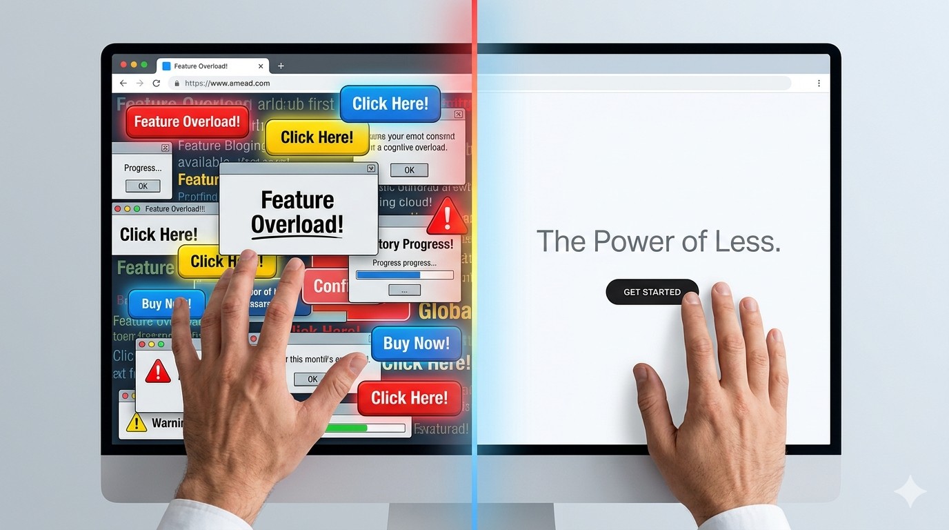
In a world that constantly screams for our attention with flashing banners, complex interfaces, and “feature-rich” products that require a PhD to operate, there is a quiet, rebellious power in doing less.
We often mistake “simple” for “basic” or “unfinished.” In reality, simplicity is the result of deep thought and rigorous editing. It’s the art of removing the noise so the music can finally be heard.
The Psychology: Why Our Brains Crave Less
Human beings are wired to seek patterns and clarity. When we encounter a cluttered design, our brains experience cognitive load—the mental effort required to process information.
When a design is simple, it reduces this friction. It allows the user to achieve their goal without having to hack through a jungle of unnecessary buttons and text. As the saying goes, “Good design is obvious. Great design is transparent.”
The Benefits of Keeping it Simple:
- Faster Decision Making: Fewer choices lead to quicker actions (Hick’s Law).
- Increased Trust: Clean designs often feel more professional and reliable.
- Better Accessibility: Stripping away the “fluff” makes products easier to use for everyone, regardless of technical skill.
The Pillars of Simple Design
Creating something simple is, ironically, quite difficult. It requires discipline to leave things out. Here are the core elements that make simplicity work:
1. Purposeful White Space
White space (or negative space) isn’t “wasted” space. It’s a literal breathing room for your content. It tells the viewer’s eye exactly where to look and creates a sense of elegance and focus.
2. Visual Hierarchy
Not every element on a page is equally important. Simple design uses size, color, and placement to create a clear “path” for the eye.
- The Headline: Large and bold.
- The Call to Action: High contrast.
- The Fine Print: Tucked away where it won’t distract.
3. Typography Over Imagery
You don’t always need a flashy photo to make an impact. Clear, readable typography does the heavy lifting of communication. When you choose one or two strong typefaces instead of five, the design immediately feels more cohesive.
Lessons from the Masters
When we think of simplicity, names like Apple or Braun often come to mind. Dieter Rams, the legendary industrial designer, championed the philosophy of “Weniger, aber besser”—Less, but better.
Think about the Google homepage. It has remained virtually unchanged for decades. Despite being one of the most powerful tools on the planet, it’s just a logo and a search bar. They could have filled that space with ads, news, or weather updates, but they understood that the user is there for one thing: to find information.
“Simplicity is the ultimate sophistication.” — Leonardo da Vinci
How to Simplify Your Next Project
If you’re looking at a design and it feels “off,” don’t ask what you can add. Ask what you can remove.
- Identify the Core Action: What is the one thing you want the user to do?
- Kill Your Darlings: If a decorative element doesn’t help the user complete that action, delete it.
- Group Similar Items: Use proximity to reduce visual clutter.
Simplicity isn’t about the absence of clutter; it’s the presence of clarity. When you respect your audience’s time and mental energy, they’ll reward you with their attention.