CSS Grids and Grid Systems
CSS grids and grid systems have evolved through the years. CSS frameworks replaced tables but were far from perfect and required CSS hacks for the website to layout properly. Items were aligned with the use of floats, then clearing the floats with a clearfix. Negative margins were used as a quick fix to correct alignment issues. Media queries altered the width of the columns based on screen width creating the new standard for responsive websites. This worked well but had several limitations as the grid had only one dimension, from left to right. As columns would collapse they would fall one under the other, creating a mobile layout. Altering the layout of the DOM was achieved by hiding certain parts of the website on certain widths and displaying them at other. This would be achieved by writing a lot of duplicate code bloating the website.
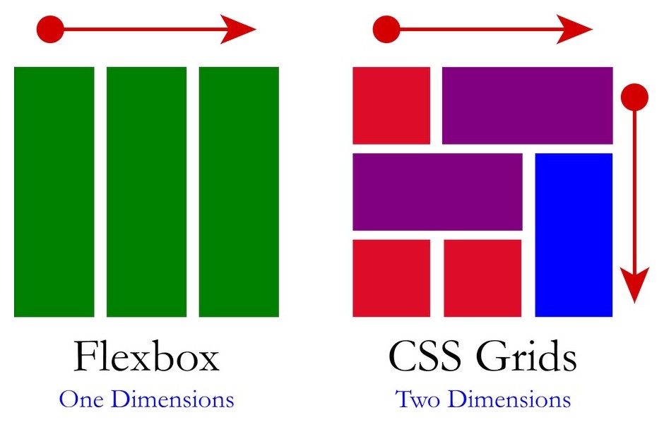
Flexbox
The next major advancement was CSS Flex. The Flexbox Grid is as the name suggests flexible. It was capable of being laid out on the x or y axis. There are several alignment enhancements and no longer the need for floats and clear fix that greatly improved and simplified coding. It was now possible to reorder blocks from within the CSS. As with all CSS advancements the issue is always browser compatibility. Compatibility today is 100% and Flexbox is used in most CSS frameworks and page builders.
CSS Grid
The CSS Grid is the most advanced system, it is now compatible with all modern browsers. CSS Grid is the first grid system that uses a two dimensional approach. Until now all systems had a one dimensional layout, CSS framework was laid out on the X-axis, one block next to the other. Flexbox allowed you to use either the x or y-axis but only one or the other. This would result in a straight line with one block laid next to or on top of one another. The advantages of CSS Grid are incredible.
CSS Grid actually has a two dimensional grid running vertically and horizontally. Any block of data can be placed anywhere on the grid regardless of how the HTML is laid out. You can even overlap or place one block on top of the other. You can easily add ad adjust both vertical and horizontal gutters. The alignment commands are very similar to flexbox. Nesting grids inside CSS Grid is easy creating endless possibilities. Even better CSS Grid can be used inside other frameworks. I urge all designers to try the new CSS Grid, the future of design is here today!

